

Automotive @ Lowe’s
Role
UX / UI
Team
Product / Researcher / Content / Design (that’s me) / Engineering
Mood
Handy 🔧
View Final Product
The Problem
Customers lack a seamless, confidence-driven way to shop for vehicle-specific parts on Lowes.com. They struggle to verify compatibility at the point of purchase and have no persistent way to save their vehicle information for future visits, leading to friction, hesitation, repeat data entry, incorrect purchases, and missed opportunities for personalization and retention.
The Solution
We designed an integrated Automotive Parts Finder and My Garage Hub experience that enabled customers to easily identify compatible parts through guided vehicle selection while also saving their vehicle information for future visits. This ecosystem reduced cognitive load, validated fitment in real time, streamlined repeat purchases, and created a personalized automotive shopping journey that improved conversion, reduced returns, and increased long-term customer value.
Potential Impact
+$2.50
RPV
+4%
CVR
-35%
ROR
The Process
Double Diamond


Problem
Solution
Discover
Define
Develop
Deliver
Discover
Define
Develop
Deliver

Discover
Research / Observe / Gather
Quantitive Interviews
We then conducted interviews to understand the “why” behind survey responses, uncovering emotional drivers and contextual details. This ensured our insights were grounded in real user experiences.
6 / 10 Users
Preferred shopping with a trusted and familiar carrier such as Autozone or Amazon.
7 / 10 Users
Did not realize Lowe’s carried auto parts & accessories.
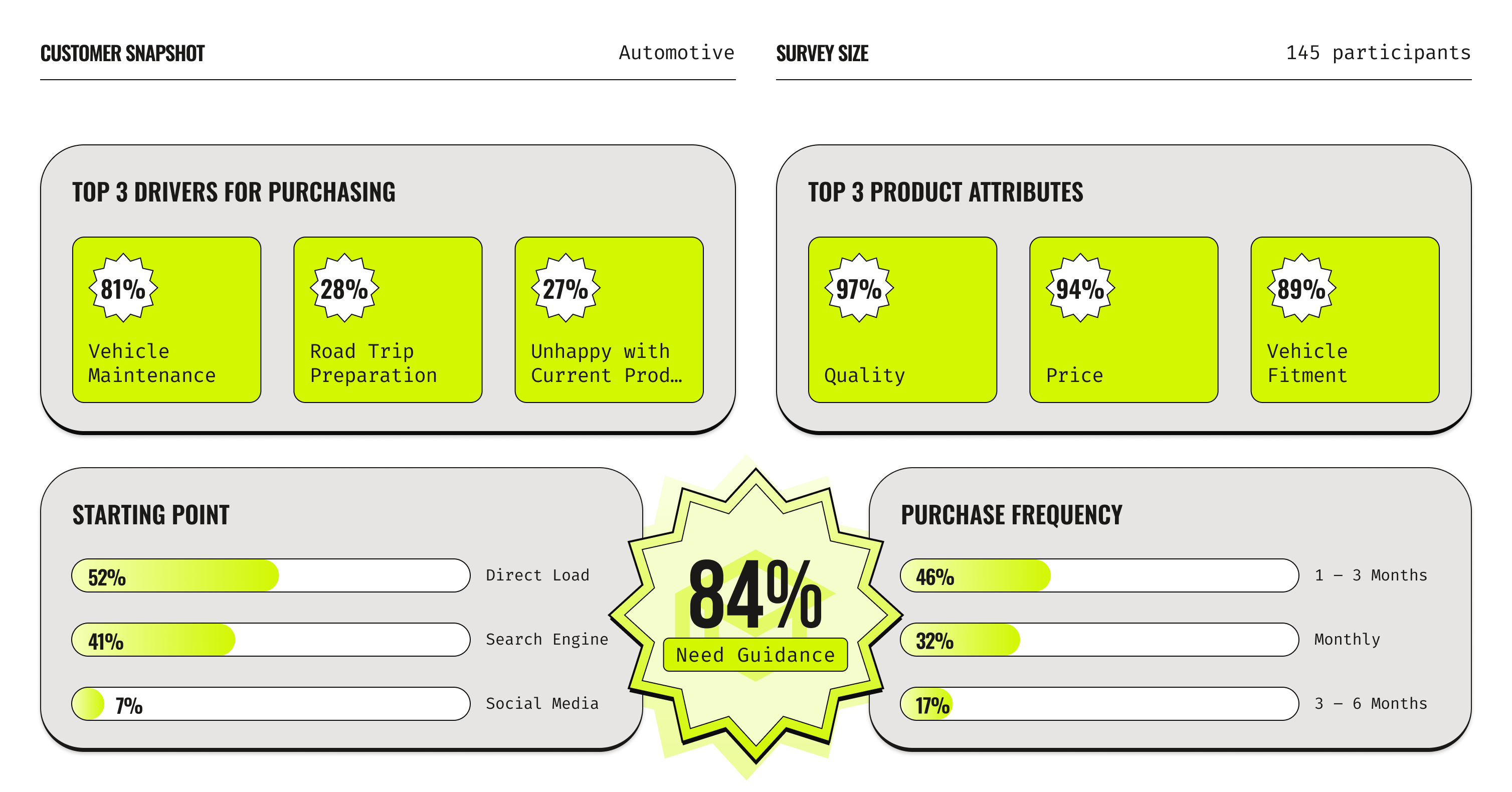
Quantitive Survey
Our researcher and I started with a large-scale survey to gather measurable data on user needs, pain points, and behaviors. This helped us identify patterns worth exploring further and set a foundation for deeper research in the Discover phase.
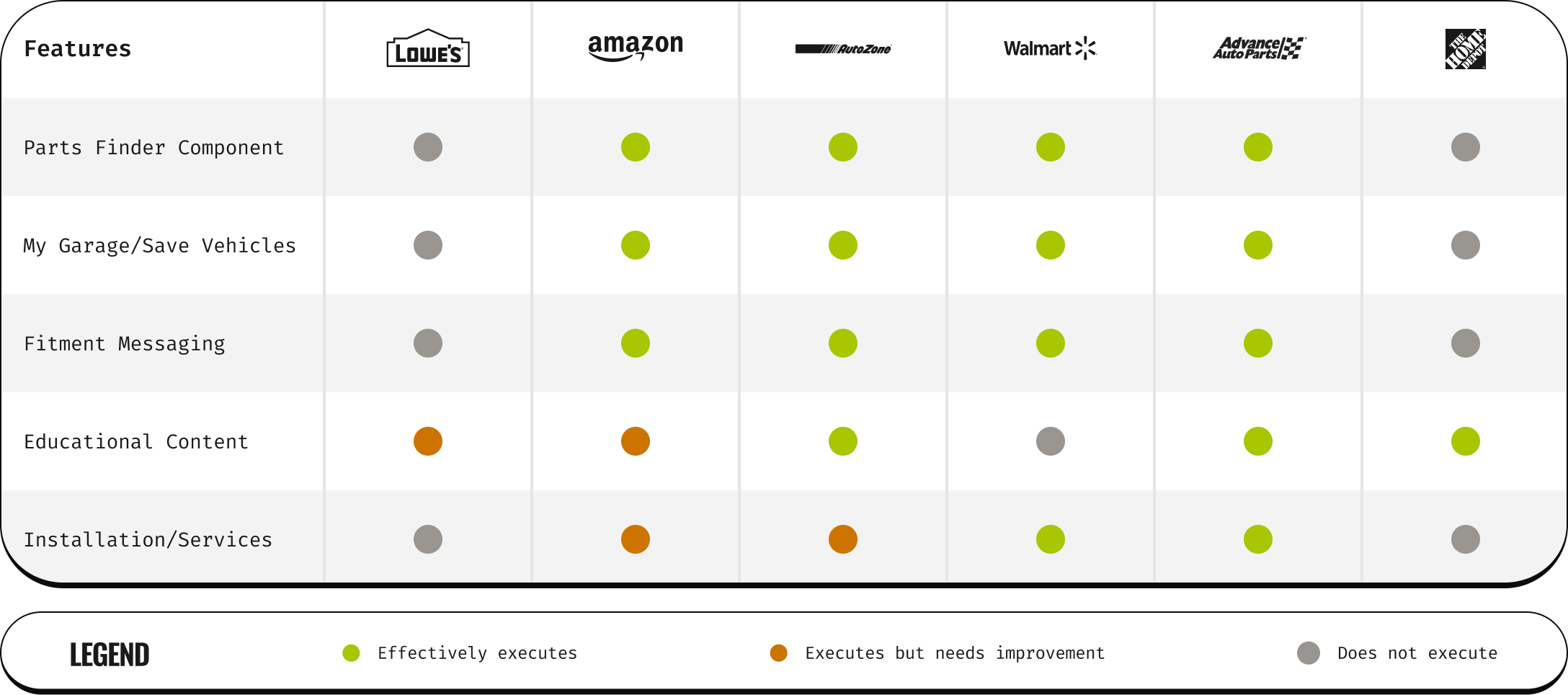
Current / Competitive Analysis
I analyzed several competitors in the automotive industry to see how similar needs are addressed in the market, identifying strengths, weaknesses, and opportunities. This provided benchmarks and inspiration for potential solutions during the tail end of Discover.
Define
Synthesize / Focus / Clarify
Five Whys
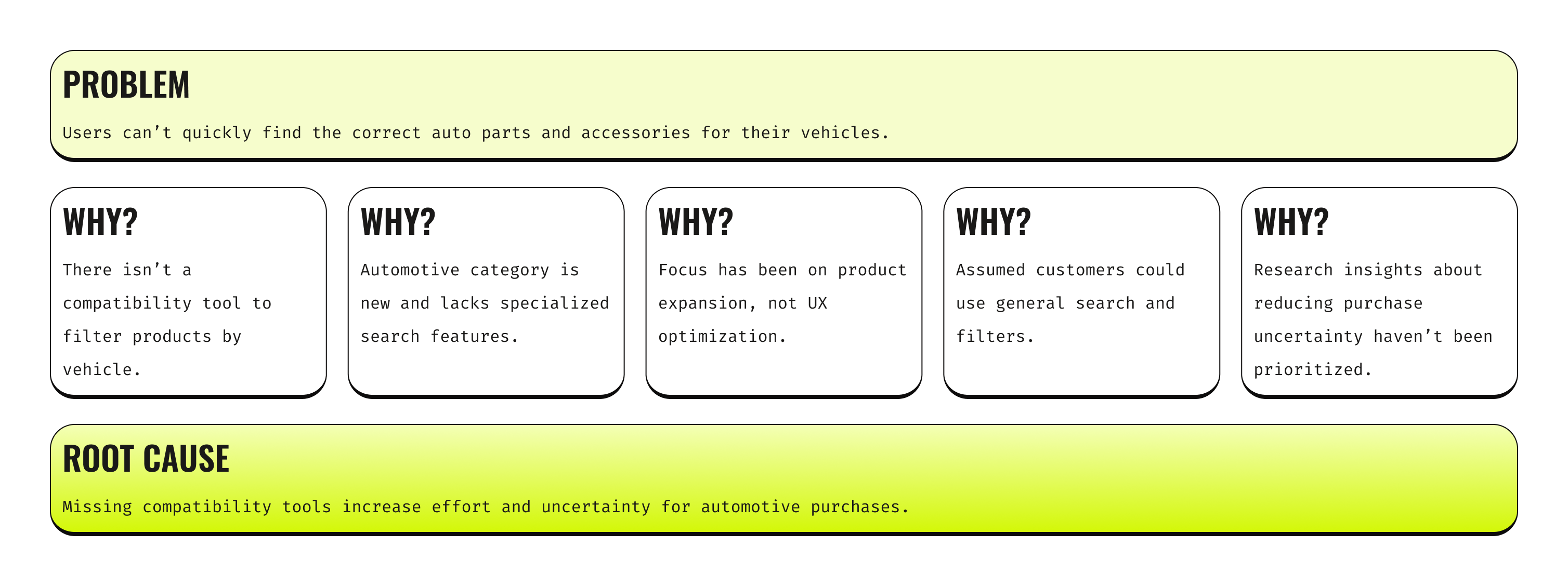
I began the Define phase with the 5 Whys technique to quickly uncover the root cause of users frustrations, ensuring our problem definition addressed the underlying issues, not just the symptoms. This helped focus our problem statement on the key barriers in the current automotive shopping experience.
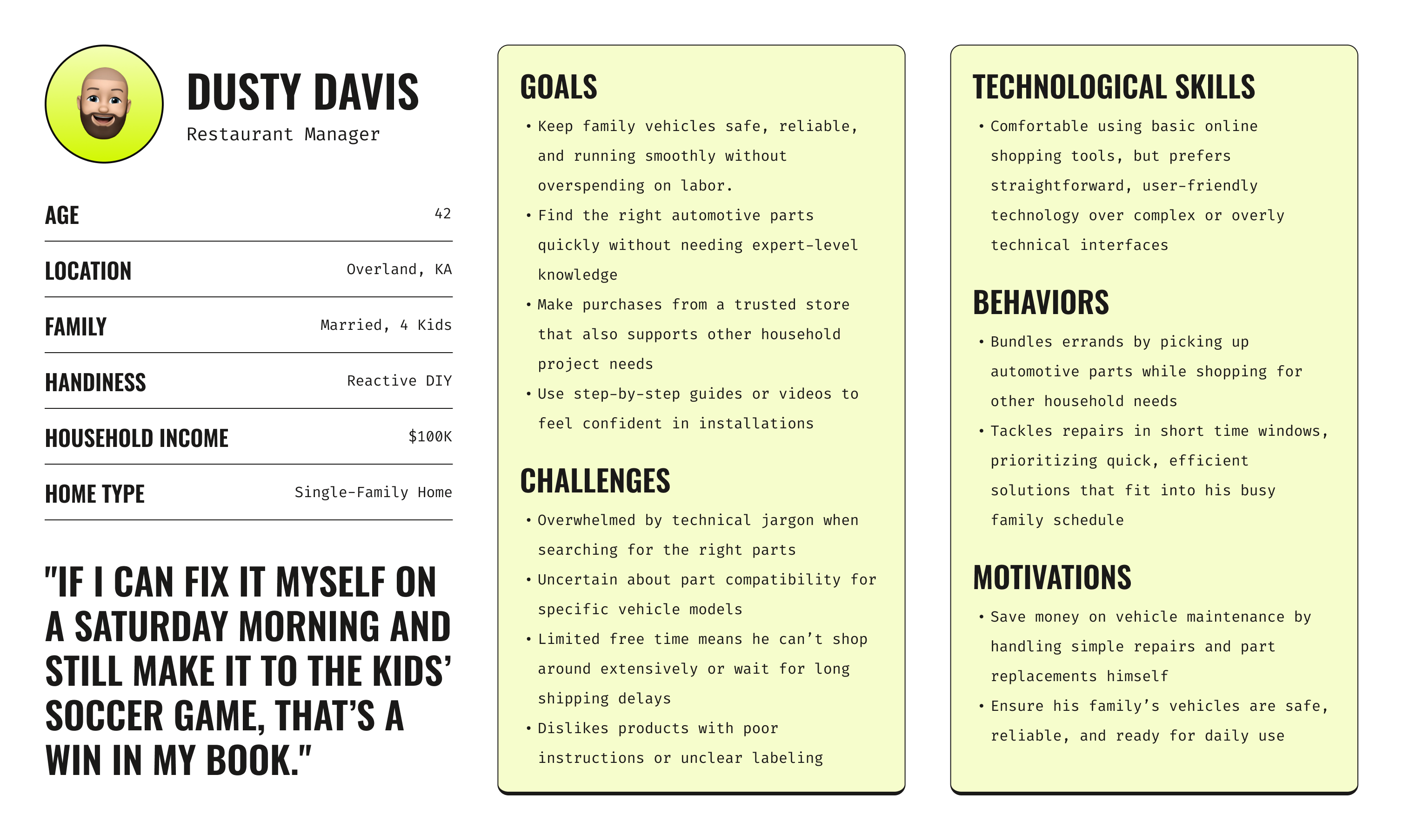
Persona
I developed a persona to humanize our research findings and keep the team aligned on a clear target user. This tool guided decision-making throughout the Define phase and into Develop.
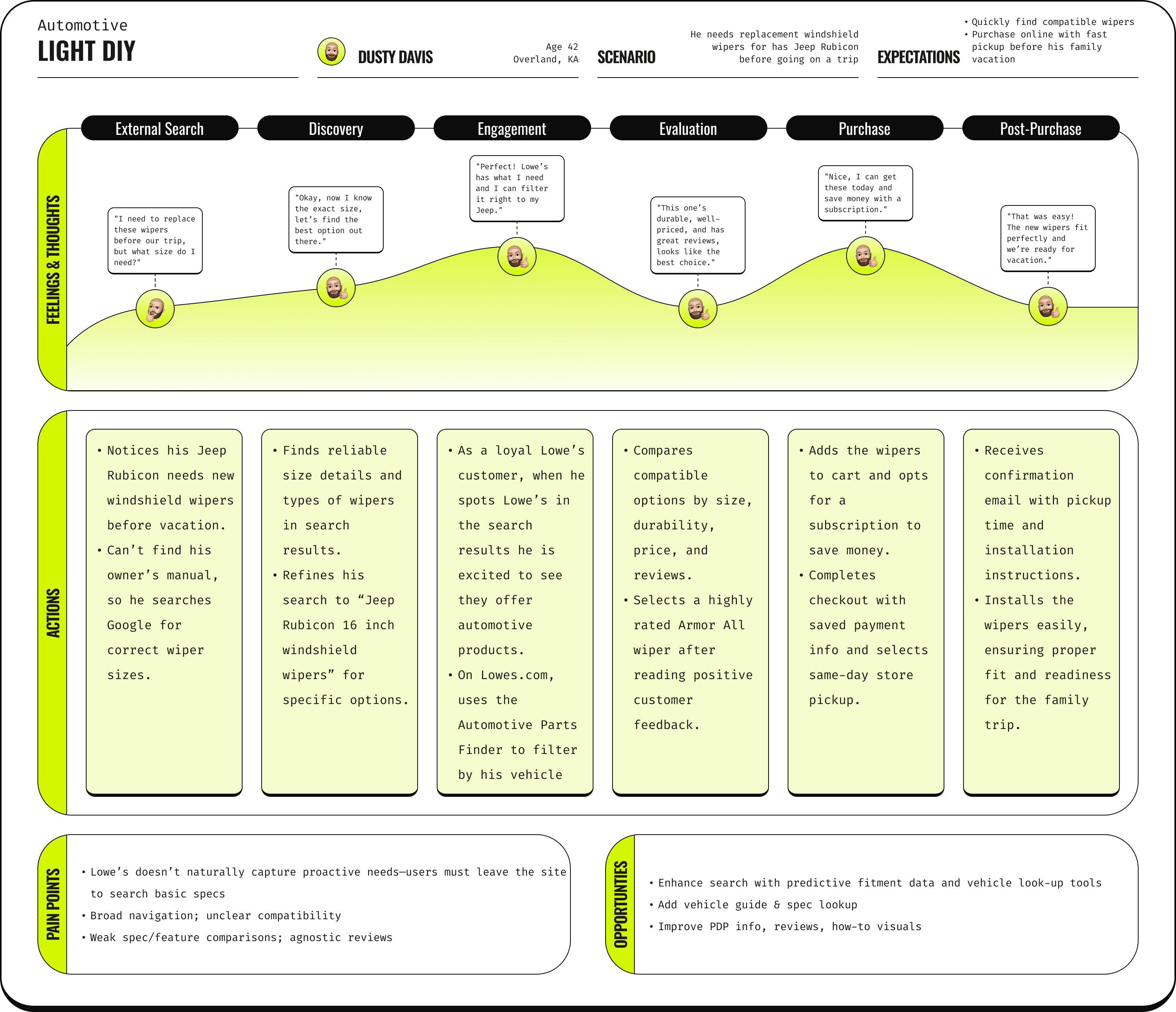
Journey Map
Once our core user was defined I mapped the user’s existing experience to visualize pain points, friction, and opportunities. This made it easier to pinpoint where the most impact could be made and where I should focus as we move into the next phase.
Empathy Map
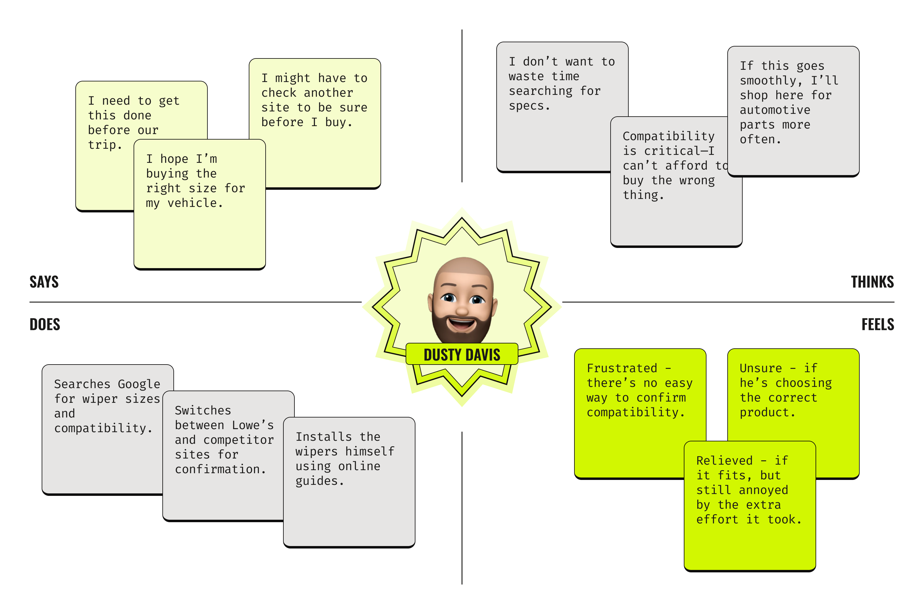
I then created an empathy map based off of the insights from our persona and his current-state journey on Lowes.com. I reviewed his actions, pain points, and emotional responses at each phase of the journey, then distilled them into what Dusty says, thinks, does, and feels. This process allowed us to capture his real frustrations, behaviors, and needs, helping identify key opportunities to improve his shopping experience.
Challenge
We synthesized all research into a clear, actionable problem statement, setting the stage for ideation in the Develop phase. This ensured that any concepts directly addressed the core challenge.
Problem Statement
Lowe’s online automotive shopping experience lacks a streamlined way for users like Dusty Davis to quickly identify and purchase compatible vehicle parts, leading to unnecessary research, confusion, and missed opportunities for conversion.
Develop
Ideate / Prototype / Test
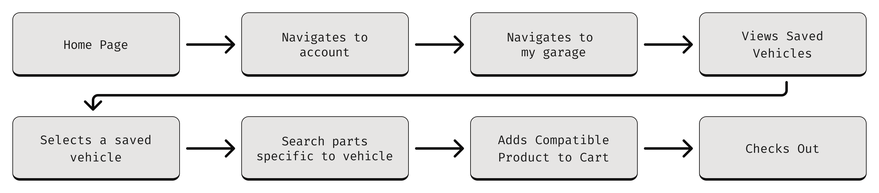
Task Flows
Our team synthesized research findings, behavioral data, and business constraints to clarify the core problem: customers lacked confidence and efficiency when shopping for vehicle-specific parts. To address both immediate compatibility friction and long-term retention opportunities, we aligned on designing two complementary features: an Automotive Parts Finder to streamline accurate part discovery at the point of purchase, and a persistent My Garage hub to save vehicles, personalize the shopping experience, and drive repeat engagement within the automotive category.
My next step was to map simple, end-to-end task flows for each feature to align on scope, identify edge cases, and ensure a frictionless user journey before moving into wireframing. Establishing these foundational flows allowed us to validate assumptions early and create a clear blueprint for design and engineering execution.
Parts Finder

My Garage Hub
User Flows
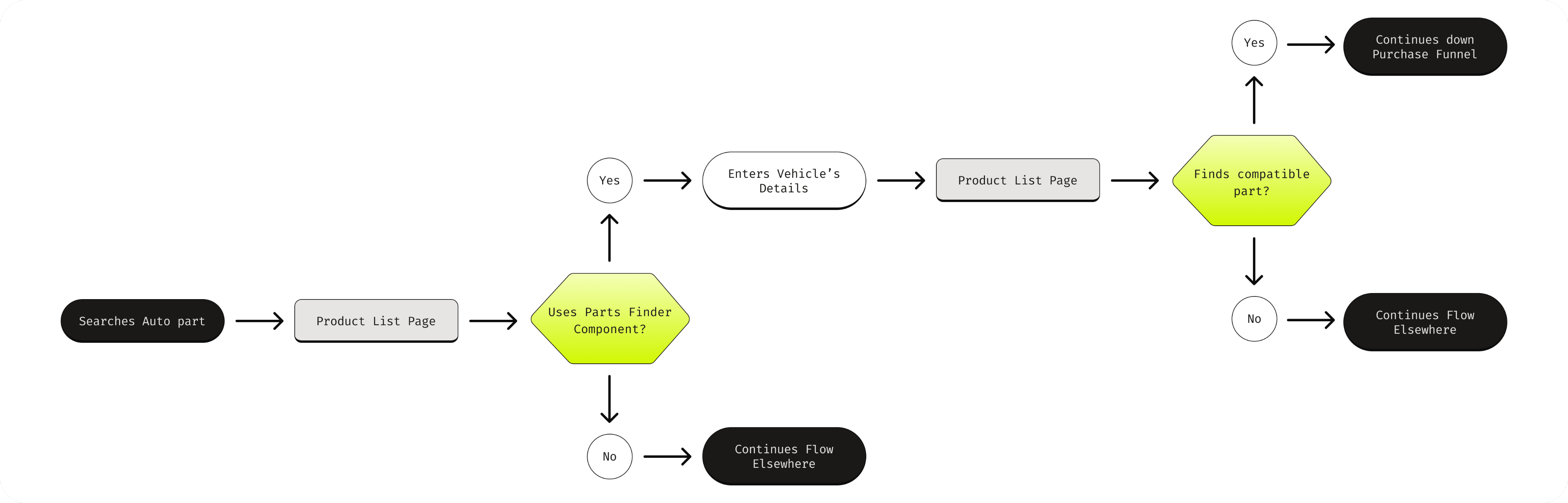
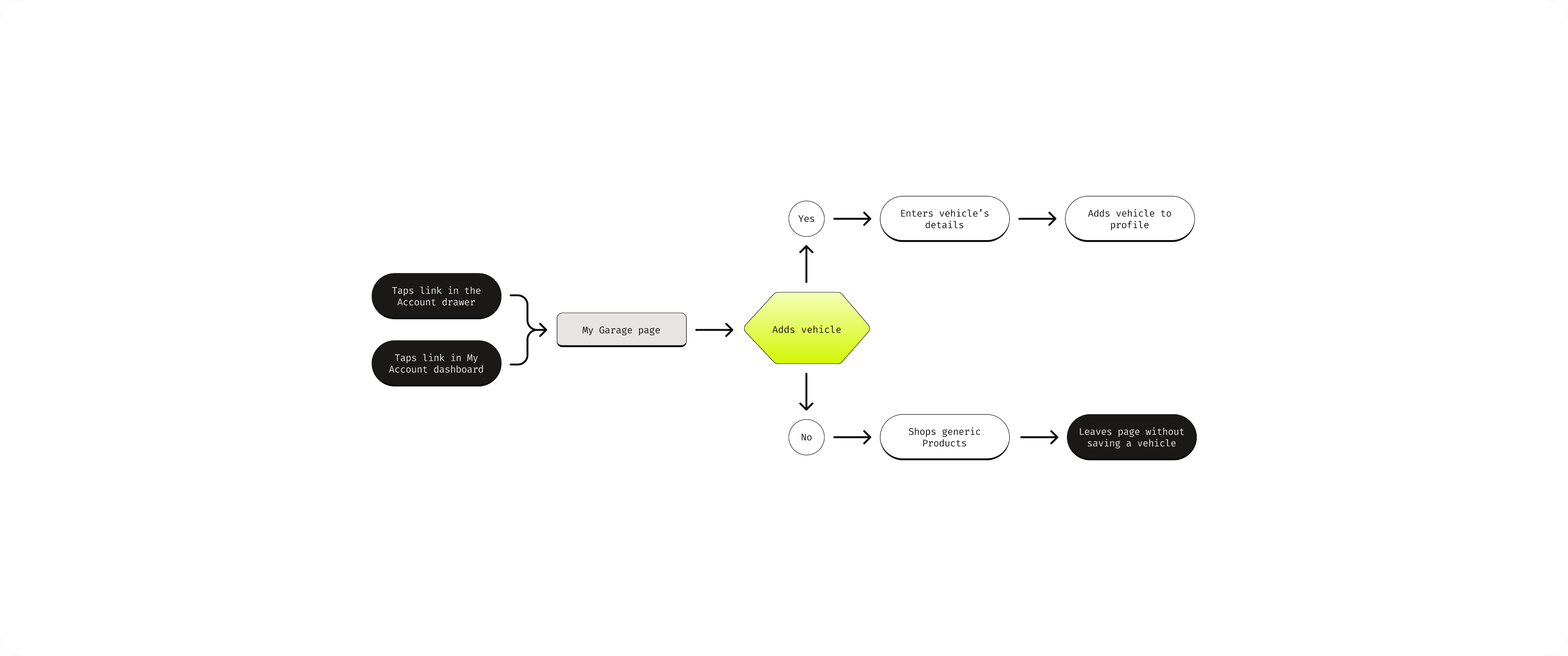
After aligning on the core task flows, I translated those linear paths into comprehensive user flows that mapped real-world decision points, edge cases, and system states. This allowed us to account for alternate entry points, error handling, cross-navigation between features, and downstream impacts on conversion—ensuring the experience was resilient, scalable, and aligned to measurable business outcomes.
Parts Finder
My Garage Hub
No Vehicles
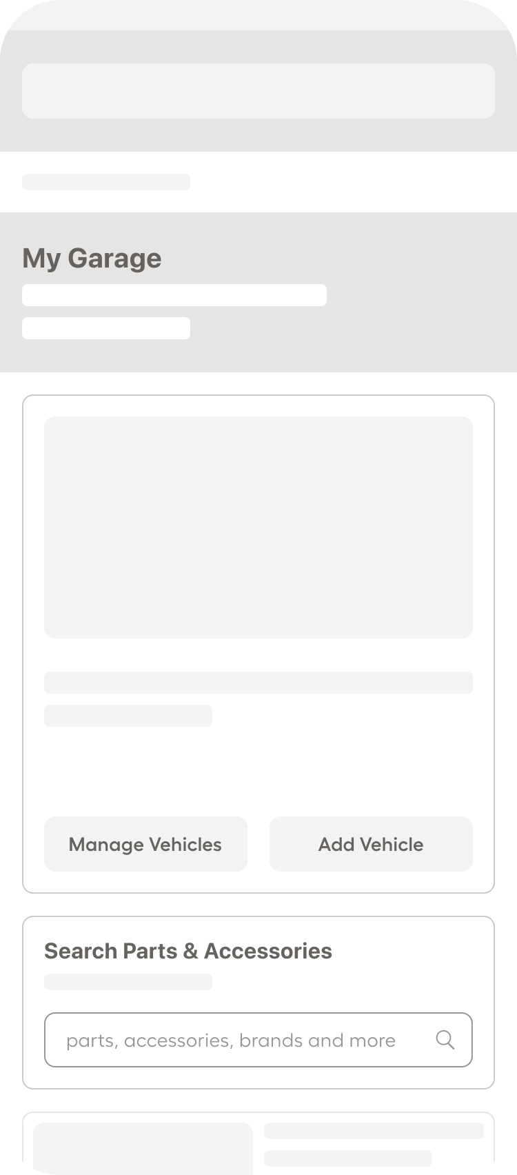
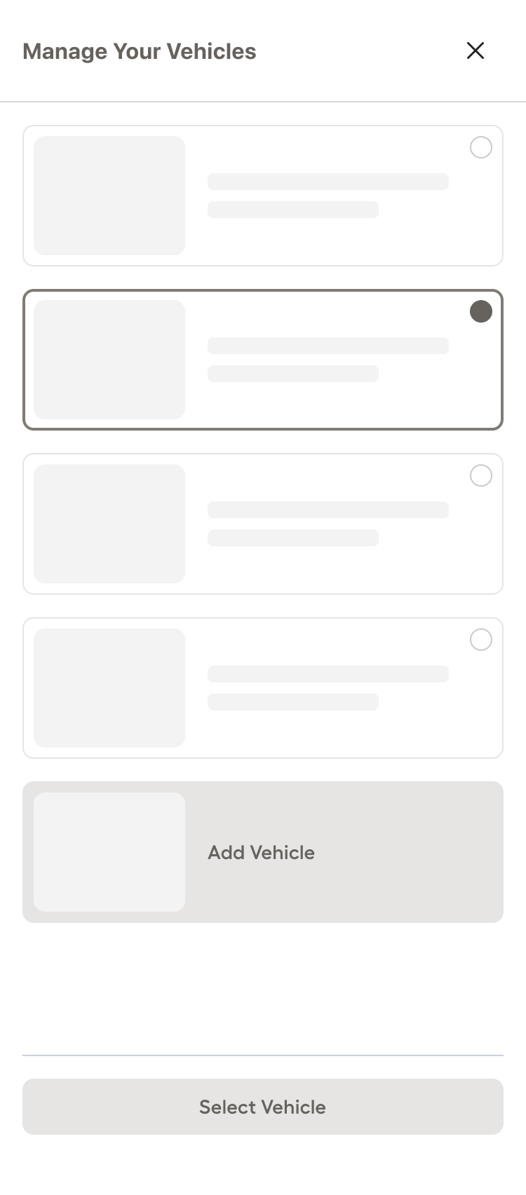
Lo-Fi Wireframes
I translated the validated user flows into low-fidelity wireframes to quickly operationalize structure, hierarchy, and interaction patterns without getting distracted by visual polish. Working in low fidelity allowed us to pressure-test layout decisions, content prioritization, and functional logic early, iterate rapidly based on feedback, and align stakeholders on core experience architecture before investing time in high-fidelity UI and design systems.
Parts Finder
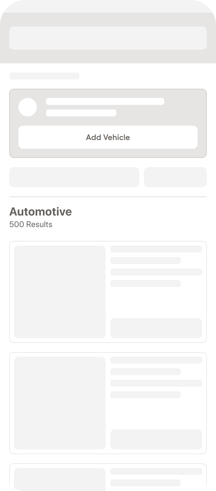
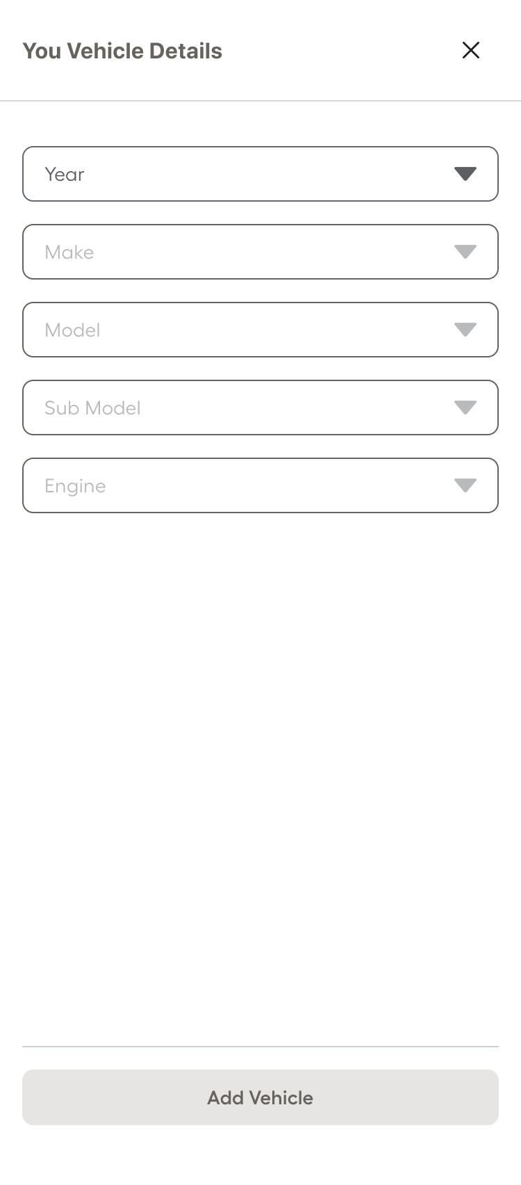
My Garage Hub
Deliver
Build / Validate / Launch
HI-Fi Prototyping
Once the team felt we had strong low-fidelity wireframes, I translated them into high-fidelity designs by applying our design system, refining visual hierarchy, and incorporating production-ready components to ensure consistency and feasibility. I then connected the screens into an interactive prototype that mirrored real user paths across Parts Finder and My Garage Hub, enabling us to test task completion, clarity of fitment feedback, and overall confidence in the experience before moving into development.
Validation Testing
With our refined prototypes in place, we conducted validation testing on two leading design variants to determine which direction delivered the strongest usability and clarity. While the sessions covered multiple interaction patterns and content treatments, we concentrated on two critical decision points: how the selected vehicle should be represented and managed within My Garage, and how the Parts Finder component should be structured on desktop.
Given that desktop traffic accounted for the majority of visits across the pages where Parts Finder would live, we paid close attention to layout density, hierarchy, and form progression in a wider viewport. The testing helped us understand how users interpreted the selected vehicle state, how easily they could switch or confirm vehicles, and which desktop layout supported faster comprehension and reduced friction. These findings allowed us to confidently move forward with the variant that balanced clarity, efficiency, and scalability.
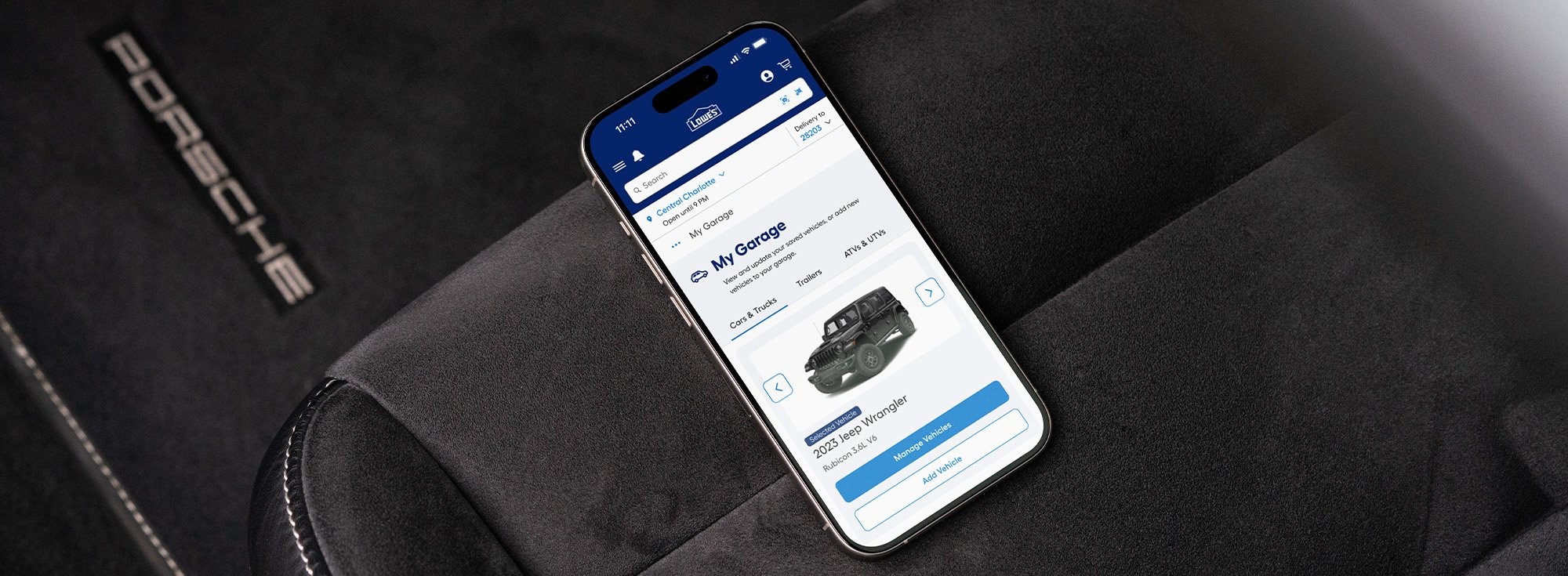
My Garage
Users preferred the single-vehicle layout (left image) because it created a stronger sense of clarity and confirmation around which vehicle was actively selected. By displaying only the selected vehicle prominently, with clear primary actions like “Change Vehicle” and “Add New Vehicle”, the interface reduced visual competition and eliminated ambiguity about fitment context.
Parts Finder
Users preferred the embedded dropdown layout (top image) because it made the vehicle selection process immediately visible and actionable within the page context. Having the Year, Make, Model, Sub Model, and Engine fields persistently displayed reduced interaction cost and reinforced transparency around how fitment was determined.
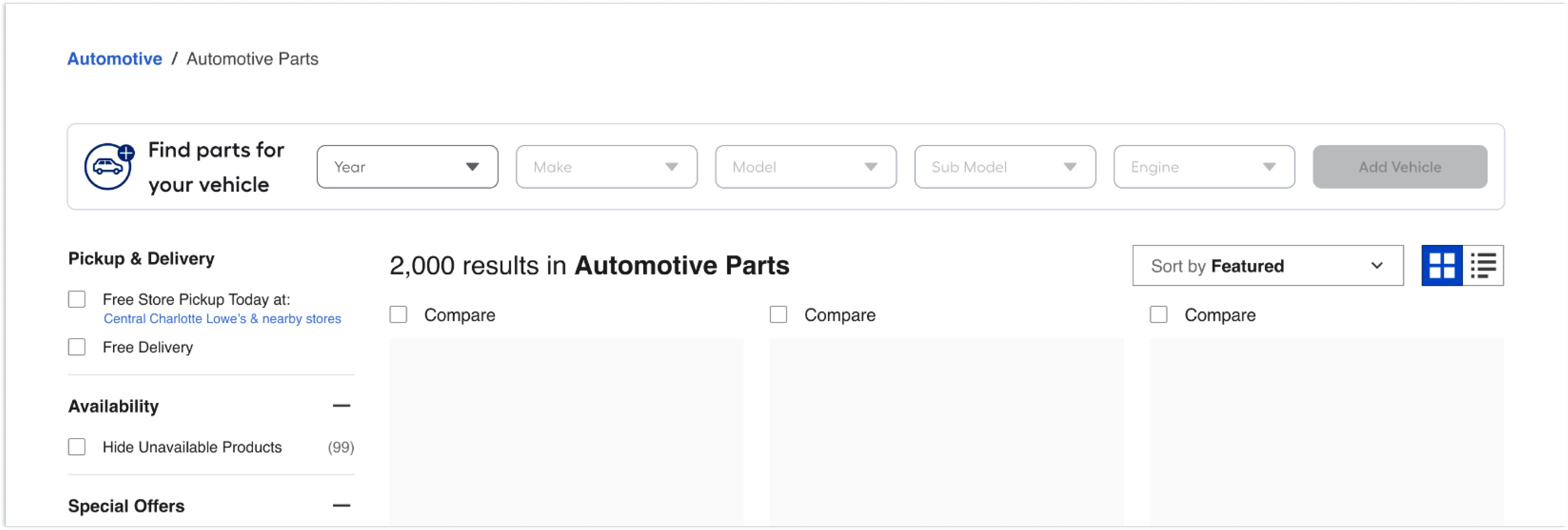

Final Product
After validation testing, for desktop the embedded dropdown experience was preferred. Based on my secondary research and the insights from testing I made updates to the designs and then handed it off to our dev team. Currently if you go to Lowes.com and search “Oil Filters” you can see phase 1 (without My Garage) of this experience live on the site.


Checkered Flag!
That was a lengthy race, but you made it across the finish line.

Copyright © 2026 Ryan Novak.
All rights reserved.


Automotive @ Lowe’s
Role
UX / UI
Team
Product / Researcher / Content / Design (that’s me) / Engineering
Mood
Handy 🔧
View Final Product
The Problem
Customers lack a seamless, confidence-driven way to shop for vehicle-specific parts on Lowes.com. They struggle to verify compatibility at the point of purchase and have no persistent way to save their vehicle information for future visits, leading to friction, hesitation, repeat data entry, incorrect purchases, and missed opportunities for personalization and retention.
The Solution
We designed an integrated Automotive Parts Finder and My Garage Hub experience that enabled customers to easily identify compatible parts through guided vehicle selection while also saving their vehicle information for future visits. This ecosystem reduced cognitive load, validated fitment in real time, streamlined repeat purchases, and created a personalized automotive shopping journey that improved conversion, reduced returns, and increased long-term customer value.
Potential Impact
+$2.50
RPV
+4%
CVR
-35%
ROR
The Process
Double Diamond


Problem
Solution
Discover
Define
Develop
Deliver
Discover
Define
Develop
Deliver
Top
Discover
Research / Observe / Gather
Quantitive Interviews
We then conducted interviews to understand the “why” behind survey responses, uncovering emotional drivers and contextual details. This ensured our insights were grounded in real user experiences.
6 / 10 Users
Preferred shopping with a trusted and familiar carrier such as Autozone or Amazon.
7 / 10 Users
Did not realize Lowe’s carried auto parts & accessories.
Quantitive Survey
Our researcher and I started with a large-scale survey to gather measurable data on user needs, pain points, and behaviors. This helped us identify patterns worth exploring further and set a foundation for deeper research in the Discover phase.
Current / Competitive Analysis
I analyzed several competitors in the automotive industry to see how similar needs are addressed in the market, identifying strengths, weaknesses, and opportunities. This provided benchmarks and inspiration for potential solutions during the tail end of Discover.
Define
Synthesize / Focus / Clarify
Five Whys
I began the Define phase with the 5 Whys technique to quickly uncover the root cause of users frustrations, ensuring our problem definition addressed the underlying issues, not just the symptoms. This helped focus our problem statement on the key barriers in the current automotive shopping experience.
Persona
I developed a persona to humanize our research findings and keep the team aligned on a clear target user. This tool guided decision-making throughout the Define phase and into Develop.
Journey Map
Once our core user was defined I mapped the user’s existing experience to visualize pain points, friction, and opportunities. This made it easier to pinpoint where the most impact could be made and where I should focus as we move into the next phase.
Empathy Map
I then created an empathy map based off of the insights from our persona and his current-state journey on Lowes.com. I reviewed his actions, pain points, and emotional responses at each phase of the journey, then distilled them into what Dusty says, thinks, does, and feels. This process allowed us to capture his real frustrations, behaviors, and needs, helping identify key opportunities to improve his shopping experience.
Challenge
We synthesized all research into a clear, actionable problem statement, setting the stage for ideation in the Develop phase. This ensured that any concepts directly addressed the core challenge.
Problem Statement
Lowe’s online automotive shopping experience lacks a streamlined way for users like Dusty Davis to quickly identify and purchase compatible vehicle parts, leading to unnecessary research, confusion, and missed opportunities for conversion.
Develop
Ideate / Prototype / Test
Task Flows
Our team synthesized research findings, behavioral data, and business constraints to clarify the core problem: customers lacked confidence and efficiency when shopping for vehicle-specific parts. To address both immediate compatibility friction and long-term retention opportunities, we aligned on designing two complementary features: an Automotive Parts Finder to streamline accurate part discovery at the point of purchase, and a persistent My Garage hub to save vehicles, personalize the shopping experience, and drive repeat engagement within the automotive category.
My next step was to map simple, end-to-end task flows for each feature to align on scope, identify edge cases, and ensure a frictionless user journey before moving into wireframing. Establishing these foundational flows allowed us to validate assumptions early and create a clear blueprint for design and engineering execution.
Parts Finder
My Garage Hub
User Flows
After aligning on the core task flows, I translated those linear paths into comprehensive user flows that mapped real-world decision points, edge cases, and system states. This allowed us to account for alternate entry points, error handling, cross-navigation between features, and downstream impacts on conversion—ensuring the experience was resilient, scalable, and aligned to measurable business outcomes.
Parts Finder
My Garage Hub
No Saved Vehicles
Lo-Fi Wireframes
I translated the validated user flows into low-fidelity wireframes to quickly operationalize structure, hierarchy, and interaction patterns without getting distracted by visual polish. Working in low fidelity allowed us to pressure-test layout decisions, content prioritization, and functional logic early, iterate rapidly based on feedback, and align stakeholders on core experience architecture before investing time in high-fidelity UI and design systems.
Parts Finder
My Garage Hub
Deliver
Build / Validate / Launch
HI-Fi Prototyping
Once the team felt we had strong low-fidelity wireframes, I translated them into high-fidelity designs by applying our design system, refining visual hierarchy, and incorporating production-ready components to ensure consistency and feasibility. I then connected the screens into an interactive prototype that mirrored real user paths across Parts Finder and My Garage Hub, enabling us to test task completion, clarity of fitment feedback, and overall confidence in the experience before moving into development.
Validation Testing
With our refined prototypes in place, we conducted validation testing on two leading design variants to determine which direction delivered the strongest usability and clarity. While the sessions covered multiple interaction patterns and content treatments, we concentrated on two critical decision points: how the selected vehicle should be represented and managed within My Garage, and how the Parts Finder component should be structured on desktop.
Given that desktop traffic accounted for the majority of visits across the pages where Parts Finder would live, we paid close attention to layout density, hierarchy, and form progression in a wider viewport. The testing helped us understand how users interpreted the selected vehicle state, how easily they could switch or confirm vehicles, and which desktop layout supported faster comprehension and reduced friction. These findings allowed us to confidently move forward with the variant that balanced clarity, efficiency, and scalability.
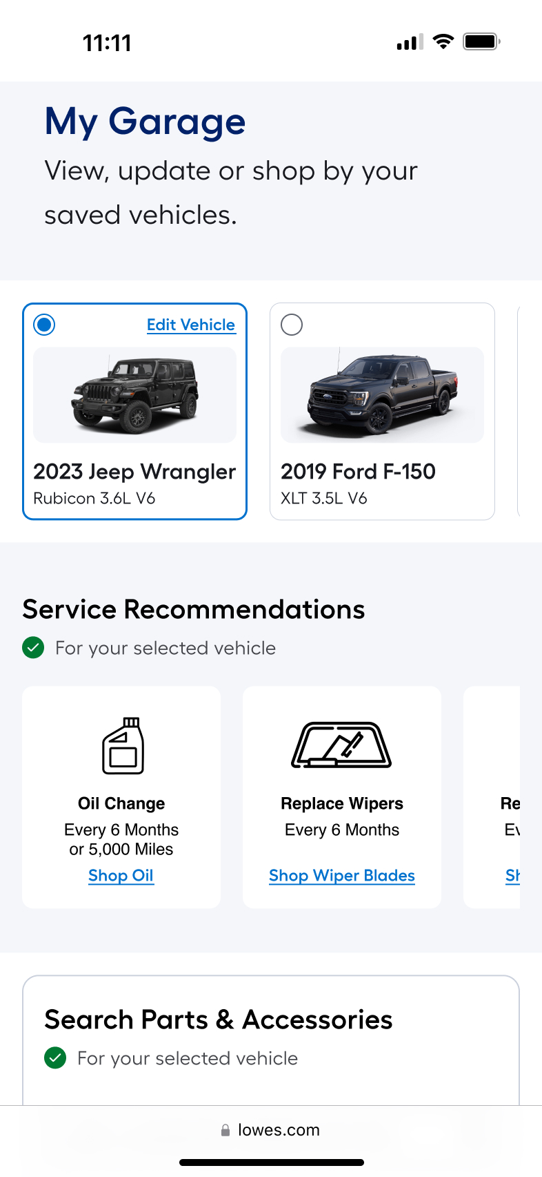
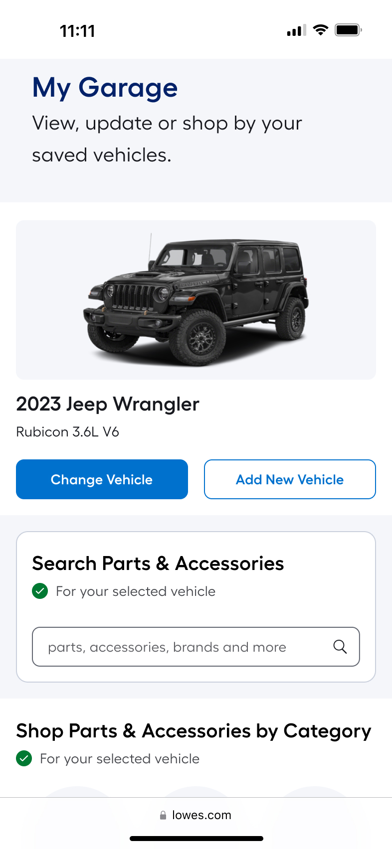
My Garage
Users preferred the single-vehicle layout (left image) because it created a stronger sense of clarity and confirmation around which vehicle was actively selected. By displaying only the selected vehicle prominently, with clear primary actions like “Change Vehicle” and “Add New Vehicle”, the interface reduced visual competition and eliminated ambiguity about fitment context.
Parts Finder
Users preferred the embedded dropdown layout (top image) because it made the vehicle selection process immediately visible and actionable within the page context. Having the Year, Make, Model, Sub Model, and Engine fields persistently displayed reduced interaction cost and reinforced transparency around how fitment was determined.
Final Product
After validation testing, for desktop the embedded dropdown experience was preferred. Based on my secondary research and the insights from testing I made updates to the designs and then handed it off to our dev team. Currently if you go to Lowes.com and search “Oil Filters” you can see phase 1 (without My Garage) of this experience live on the site.


Checkered Flag!
That was a lengthy race, but you made it across the finish line.
Copyright © 2026 Ryan Novak.
All rights reserved.


Automotive @ Lowe’s
Role
UX / UI
Team
Product / Researcher / Content / Design (that’s me) / Engineering
Mood
Handy 🔧
View Final Product
The Problem
Customers lack a seamless, confidence-driven way to shop for vehicle-specific parts on Lowes.com. They struggle to verify compatibility at the point of purchase and have no persistent way to save their vehicle information for future visits, leading to friction, hesitation, repeat data entry, incorrect purchases, and missed opportunities for personalization and retention.
The Solution
We designed an integrated Automotive Parts Finder and My Garage Hub experience that enabled customers to easily identify compatible parts through guided vehicle selection while also saving their vehicle information for future visits. This ecosystem reduced cognitive load, validated fitment in real time, streamlined repeat purchases, and created a personalized automotive shopping journey that improved conversion, reduced returns, and increased long-term customer value.
Potential Impact
+$2.50
RPV
+4%
CVR
-35%
ROR
The Process
Double Diamond


Problem
Solution
Discover
Define
Develop
Deliver
Discover
Define
Develop
Deliver

Back to Top
Discover
Research / Observe / Gather
Quantitive Survey
Our researcher and I started with a large-scale survey to gather measurable data on user needs, pain points, and behaviors. This helped us identify patterns worth exploring further and set a foundation for deeper research in the Discover phase.
Quantitive Interviews
We then conducted interviews to understand the “why” behind survey responses, uncovering emotional drivers and contextual details. This ensured our insights were grounded in real user experiences.
6 / 10 Users
Preferred shopping with a trusted and familiar carrier such as Autozone or Amazon.
7 / 10 Users
Did not realize Lowe’s carried auto parts & accessories.
Current / Competitive Analysis
I analyzed several competitors in the automotive industry to see how similar needs are addressed in the market, identifying strengths, weaknesses, and opportunities. This provided benchmarks and inspiration for potential solutions during the tail end of Discover.
Define
Synthesize / Focus / Clarify
Five Whys
I began the Define phase with the 5 Whys technique to quickly uncover the root cause of users frustrations, ensuring our problem definition addressed the underlying issues, not just the symptoms. This helped focus our problem statement on the key barriers in the current automotive shopping experience.
Persona
I developed a persona to humanize our research findings and keep the team aligned on a clear target user. This tool guided decision-making throughout the Define phase and into Develop.
Journey Map
Once our core user was defined I mapped the user’s existing experience to visualize pain points, friction, and opportunities. This made it easier to pinpoint where the most impact could be made and where I should focus as we move into the next phase.
Empathy Map
I then created an empathy map based off of the insights from our persona and his current-state journey on Lowes.com. I reviewed his actions, pain points, and emotional responses at each phase of the journey, then distilled them into what Dusty says, thinks, does, and feels. This process allowed us to capture his real frustrations, behaviors, and needs, helping identify key opportunities to improve his shopping experience.
Challenge
We synthesized all research into a clear, actionable problem statement, setting the stage for ideation in the Develop phase. This ensured that any concepts directly addressed the core challenge.
Problem Statement
Lowe’s online automotive shopping experience lacks a streamlined way for users like Dusty Davis to quickly identify and purchase compatible vehicle parts, leading to unnecessary research, confusion, and missed opportunities for conversion.
Develop
Ideate / Prototype / Test
Task Flows
Our team synthesized research findings, behavioral data, and business constraints to clarify the core problem: customers lacked confidence and efficiency when shopping for vehicle-specific parts. To address both immediate compatibility friction and long-term retention opportunities, we aligned on designing two complementary features: an Automotive Parts Finder to streamline accurate part discovery at the point of purchase, and a persistent My Garage hub to save vehicles, personalize the shopping experience, and drive repeat engagement within the automotive category.
My next step was to map simple, end-to-end task flows for each feature to align on scope, identify edge cases, and ensure a frictionless user journey before moving into wireframing. Establishing these foundational flows allowed us to validate assumptions early and create a clear blueprint for design and engineering execution.
Parts Finder
My Garage Hub
User Flows
After aligning on the core task flows, I translated those linear paths into comprehensive user flows that mapped real-world decision points, edge cases, and system states. This allowed us to account for alternate entry points, error handling, cross-navigation between features, and downstream impacts on conversion—ensuring the experience was resilient, scalable, and aligned to measurable business outcomes.
Parts Finder
My Garage Hub
No Saved Vehicles
Lo-Fi Wireframes
I translated the validated user flows into low-fidelity wireframes to quickly operationalize structure, hierarchy, and interaction patterns without getting distracted by visual polish. Working in low fidelity allowed us to pressure-test layout decisions, content prioritization, and functional logic early, iterate rapidly based on feedback, and align stakeholders on core experience architecture before investing time in high-fidelity UI and design systems.
Parts Finder
My Garage Hub
Deliver
Build / Validate / Launch
HI-Fi Prototyping
Once the team felt we had strong low-fidelity wireframes, I translated them into high-fidelity designs by applying our design system, refining visual hierarchy, and incorporating production-ready components to ensure consistency and feasibility. I then connected the screens into an interactive prototype that mirrored real user paths across Parts Finder and My Garage Hub, enabling us to test task completion, clarity of fitment feedback, and overall confidence in the experience before moving into development.
Validation Testing
With our refined prototypes in place, we conducted validation testing on two leading design variants to determine which direction delivered the strongest usability and clarity. While the sessions covered multiple interaction patterns and content treatments, we concentrated on two critical decision points: how the selected vehicle should be represented and managed within My Garage, and how the Parts Finder component should be structured on desktop.
Given that desktop traffic accounted for the majority of visits across the pages where Parts Finder would live, we paid close attention to layout density, hierarchy, and form progression in a wider viewport. The testing helped us understand how users interpreted the selected vehicle state, how easily they could switch or confirm vehicles, and which desktop layout supported faster comprehension and reduced friction. These findings allowed us to confidently move forward with the variant that balanced clarity, efficiency, and scalability.
My Garage
Users preferred the single-vehicle layout (left image) because it created a stronger sense of clarity and confirmation around which vehicle was actively selected. By displaying only the selected vehicle prominently, with clear primary actions like “Change Vehicle” and “Add New Vehicle”, the interface reduced visual competition and eliminated ambiguity about fitment context.
Parts Finder
Users preferred the embedded dropdown layout (top image) because it made the vehicle selection process immediately visible and actionable within the page context. Having the Year, Make, Model, Sub Model, and Engine fields persistently displayed reduced interaction cost and reinforced transparency around how fitment was determined.
Final Product
After validation testing, for desktop the embedded dropdown experience was preferred. Based on my secondary research and the insights from testing I made updates to the designs and then handed it off to our dev team. Currently if you go to Lowes.com and search “Oil Filters” you can see phase 1 (without My Garage) of this experience live on the site.


Checkered Flag!
That was a lengthy race, but you made it across the finish line.
Copyright © 2026 Ryan Novak.
All rights reserved.
Automotive @ Lowe’s
Role
UX / UI
Team
Product / Researcher / Content / Design (that’s me) / Engineering
Mood
Handy 🔧
View Final Product
The Problem
Customers lack a seamless, confidence-driven way to shop for vehicle-specific parts on Lowes.com. They struggle to verify compatibility at the point of purchase and have no persistent way to save their vehicle information for future visits, leading to friction, hesitation, repeat data entry, incorrect purchases, and missed opportunities for personalization and retention.
The Solution
We designed an integrated Automotive Parts Finder and My Garage Hub experience that enabled customers to easily identify compatible parts through guided vehicle selection while also saving their vehicle information for future visits. This ecosystem reduced cognitive load, validated fitment in real time, streamlined repeat purchases, and created a personalized automotive shopping journey that improved conversion, reduced returns, and increased long-term customer value.
Potential Impact
+$2.50
RPV
+4%
CVR
-35%
ROR
The Process
Double Diamond


Problem
Solution
Discover
Define
Develop
Deliver
Discover
Define
Develop
Deliver
Back to Top
Discover
Research / Observe / Gather
Quantitive Survey
Our researcher and I started with a large-scale survey to gather measurable data on user needs, pain points, and behaviors. This helped us identify patterns worth exploring further and set a foundation for deeper research in the Discover phase.
Quantitive Interviews
We then conducted interviews to understand the “why” behind survey responses, uncovering emotional drivers and contextual details. This ensured our insights were grounded in real user experiences.
6 / 10 Users
Preferred shopping with a trusted and familiar carrier such as Autozone or Amazon.
7 / 10 Users
Did not realize Lowe’s carried auto parts & accessories.
Current / Competitive Analysis
I analyzed several competitors in the automotive industry to see how similar needs are addressed in the market, identifying strengths, weaknesses, and opportunities. This provided benchmarks and inspiration for potential solutions during the tail end of Discover.
Define
Synthesize / Focus / Clarify
Five Whys
I began the Define phase with the 5 Whys technique to quickly uncover the root cause of users frustrations, ensuring our problem definition addressed the underlying issues, not just the symptoms. This helped focus our problem statement on the key barriers in the current automotive shopping experience.
Persona
I developed a persona to humanize our research findings and keep the team aligned on a clear target user. This tool guided decision-making throughout the Define phase and into Develop.
Journey Map
Once our core user was defined I mapped the user’s existing experience to visualize pain points, friction, and opportunities. This made it easier to pinpoint where the most impact could be made and where I should focus as we move into the next phase.
Empathy Map
I then created an empathy map based off of the insights from our persona and his current-state journey on Lowes.com. I reviewed his actions, pain points, and emotional responses at each phase of the journey, then distilled them into what Dusty says, thinks, does, and feels. This process allowed us to capture his real frustrations, behaviors, and needs, helping identify key opportunities to improve his shopping experience.
Challenge
We synthesized all research into a clear, actionable problem statement, setting the stage for ideation in the Develop phase. This ensured that any concepts directly addressed the core challenge.
Problem Statement
Lowe’s online automotive shopping experience lacks a streamlined way for users like Dusty Davis to quickly identify and purchase compatible vehicle parts, leading to unnecessary research, confusion, and missed opportunities for conversion.
Develop
Ideate / Prototype / Test
Task Flows
Our team synthesized research findings, behavioral data, and business constraints to clarify the core problem: customers lacked confidence and efficiency when shopping for vehicle-specific parts. To address both immediate compatibility friction and long-term retention opportunities, we aligned on designing two complementary features: an Automotive Parts Finder to streamline accurate part discovery at the point of purchase, and a persistent My Garage hub to save vehicles, personalize the shopping experience, and drive repeat engagement within the automotive category.
My next step was to map simple, end-to-end task flows for each feature to align on scope, identify edge cases, and ensure a frictionless user journey before moving into wireframing. Establishing these foundational flows allowed us to validate assumptions early and create a clear blueprint for design and engineering execution.
Parts Finder
My Garage Hub
User Flows
After aligning on the core task flows, I translated those linear paths into comprehensive user flows that mapped real-world decision points, edge cases, and system states. This allowed us to account for alternate entry points, error handling, cross-navigation between features, and downstream impacts on conversion—ensuring the experience was resilient, scalable, and aligned to measurable business outcomes.
Parts Finder
My Garage Hub
No Saved Vehicles
Lo-Fi Wireframes
I translated the validated user flows into low-fidelity wireframes to quickly operationalize structure, hierarchy, and interaction patterns without getting distracted by visual polish. Working in low fidelity allowed us to pressure-test layout decisions, content prioritization, and functional logic early, iterate rapidly based on feedback, and align stakeholders on core experience architecture before investing time in high-fidelity UI and design systems.
Parts Finder
My Garage Hub
Deliver
Build / Validate / Launch
HI-Fi Prototyping
Once the team felt we had strong low-fidelity wireframes, I translated them into high-fidelity designs by applying our design system, refining visual hierarchy, and incorporating production-ready components to ensure consistency and feasibility. I then connected the screens into an interactive prototype that mirrored real user paths across Parts Finder and My Garage Hub, enabling us to test task completion, clarity of fitment feedback, and overall confidence in the experience before moving into development.
Validation Testing
With our refined prototypes in place, we conducted validation testing on two leading design variants to determine which direction delivered the strongest usability and clarity. While the sessions covered multiple interaction patterns and content treatments, we concentrated on two critical decision points: how the selected vehicle should be represented and managed within My Garage, and how the Parts Finder component should be structured on desktop.
Given that desktop traffic accounted for the majority of visits across the pages where Parts Finder would live, we paid close attention to layout density, hierarchy, and form progression in a wider viewport. The testing helped us understand how users interpreted the selected vehicle state, how easily they could switch or confirm vehicles, and which desktop layout supported faster comprehension and reduced friction. These findings allowed us to confidently move forward with the variant that balanced clarity, efficiency, and scalability.
My Garage
Users preferred the single-vehicle layout (left image) because it created a stronger sense of clarity and confirmation around which vehicle was actively selected. By displaying only the selected vehicle prominently, with clear primary actions like “Change Vehicle” and “Add New Vehicle”, the interface reduced visual competition and eliminated ambiguity about fitment context.
Parts Finder
Users preferred the embedded dropdown layout (top image) because it made the vehicle selection process immediately visible and actionable within the page context. Having the Year, Make, Model, Sub Model, and Engine fields persistently displayed reduced interaction cost and reinforced transparency around how fitment was determined.
Final Product
After validation testing, for desktop the embedded dropdown experience was preferred. Based on my secondary research and the insights from testing I made updates to the designs and then handed it off to our dev team. Currently if you go to Lowes.com and search “Oil Filters” you can see phase 1 (without My Garage) of this experience live on the site.
Checkered Flag!
That was a lengthy race, but you made it across the finish line.
Copyright © 2026 Ryan Novak.
All rights reserved.